New Gap Logo
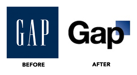
![]() I think the Gap's clothing line evolved and it's logo didn't. I remember when they first opened, they sold a Collegiate style, kind of east coast yuppie clothing, khakis, white or plaid shirts with v-neck sweaters. Now their clothing style is hip and cool. The logo never reflected those transitions so when you try to make that transition now, it's a very big change. That's what people are reacting to. I think you could bring the original logo up to date without such a drastic change. I would like to see a version of the sans serif inside the original blue box, but thicker and brought out to the edges. I'd also try the same technique in the original font.From a production point of view, the new logo will be difficult to apply as 1 color, it also looks like the blue square has a transition of color, this could be a problem in reproduction of some materials.In defense of the design firm who did the redesign. I know that sometimes it's impossible to sway the client into the right design. They can, in may cases make a bad decision or influence the designer to create what they want, which is not necessarily what's best for the brand and marketing of the product.What do you think?For more info.
I think the Gap's clothing line evolved and it's logo didn't. I remember when they first opened, they sold a Collegiate style, kind of east coast yuppie clothing, khakis, white or plaid shirts with v-neck sweaters. Now their clothing style is hip and cool. The logo never reflected those transitions so when you try to make that transition now, it's a very big change. That's what people are reacting to. I think you could bring the original logo up to date without such a drastic change. I would like to see a version of the sans serif inside the original blue box, but thicker and brought out to the edges. I'd also try the same technique in the original font.From a production point of view, the new logo will be difficult to apply as 1 color, it also looks like the blue square has a transition of color, this could be a problem in reproduction of some materials.In defense of the design firm who did the redesign. I know that sometimes it's impossible to sway the client into the right design. They can, in may cases make a bad decision or influence the designer to create what they want, which is not necessarily what's best for the brand and marketing of the product.What do you think?For more info.