Producing Advertising Typography

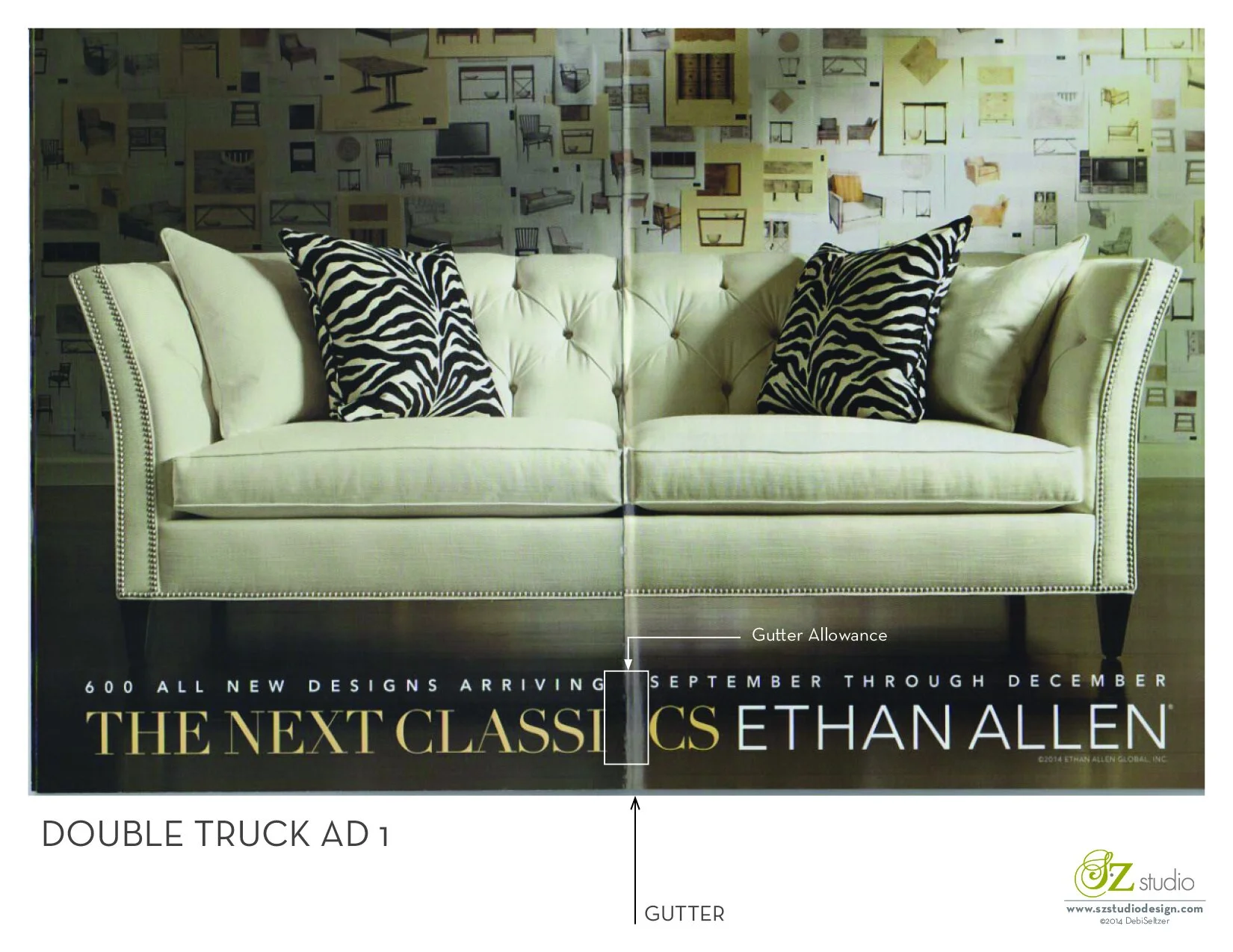
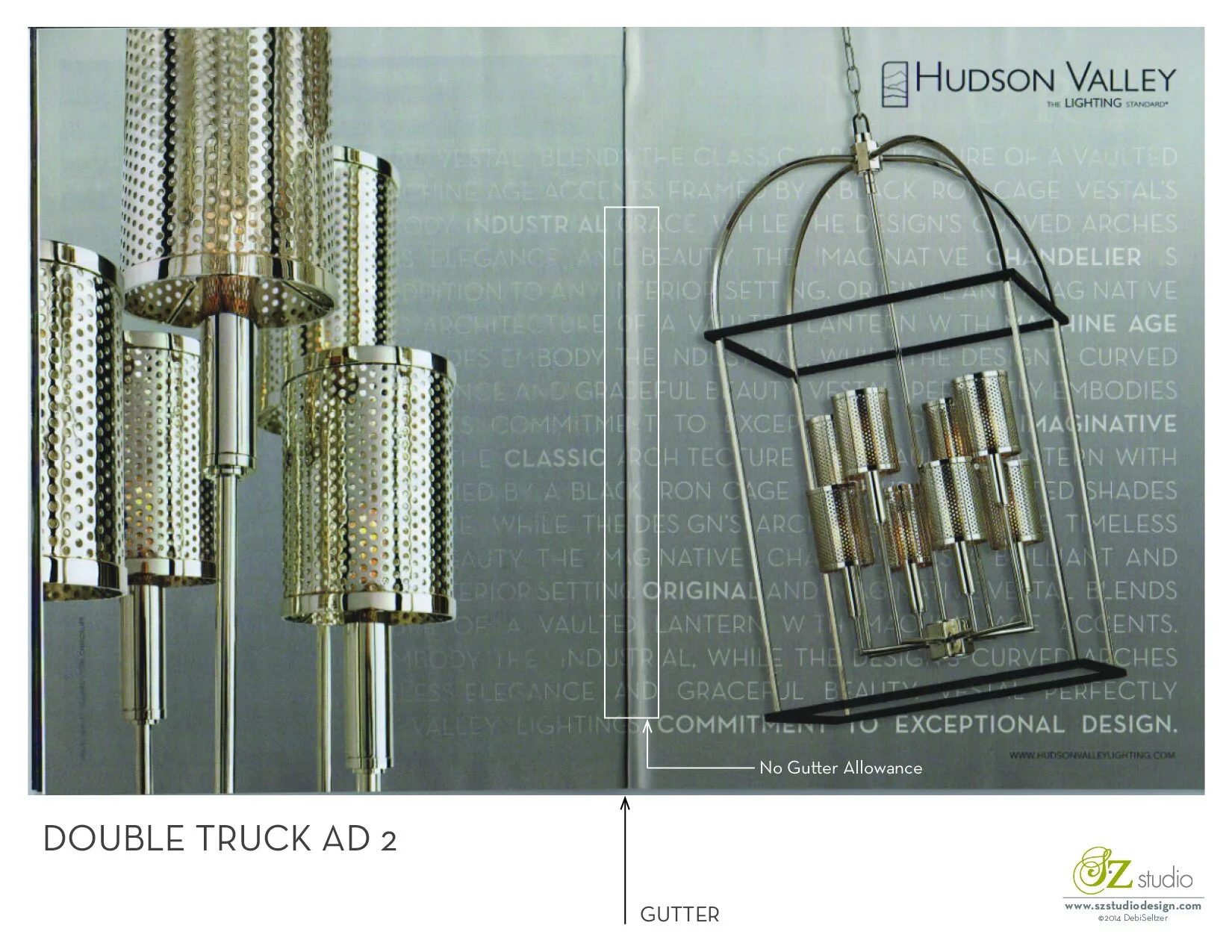
 Hi, Here is the second version of a double truck ad. This one leaves no gutter allowance for the typography. I know the design is using the typography to create a texture in the background of the ad, but I think I still would have allowed for the gutter, because you can still read the words even though they are screened back. If the production artist had left 1/8 inch allowance on each side of the gutter (or even 1/32 inch) it would have made all of the words legible. What do you think? Does it matter since the type is being used as a texture? Do you think the designer wants us to read the type? or not?